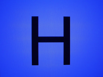
Happy Birthday!

"The most common typeface in American society. 'You see it on police cars, on garbage trucks. You know a typeface has arrived when it appears on a garbage truck.' It is also the official typeface of the New York subway system. For many graphic designers, the decades-old rule still holds: When in doubt, use Helvetica." It is "sans serif", meaning no accentuating lines or decorative touches, and is simple and plain and easy to read. Max Miedinger of Switzerland created this typeface in 1957 for the Haas'sche Schriftgiesserei type-design foundry in Switzerland. The name is the ancient Roman word for Switzerland. The typeface Ariel is a near clone of Helvetica, and is the Microsoft alteration intended to avoid licensing fees. Source: Bob Bahr, "Drawing" magazine, Spring 2006, pp. 83"
I know many a designer who would rather gag than use Helvetica, the most common typeface in the country. But, in the right place, it is the right type. For Modernists, trying to survive the angst of the 50's, the arrival of this clean, Swiss (at the time, the Swiss ruled graphic style) sans serif type was a god-send.
Happy Birthday Hel-vet-i-ca, Happy Birthday to yooooou.
No comments:
Post a Comment